As someone who has spent the majority of his life immersed in punk, and who long ago cut his visual teeth on punk aesthetic, I always love those rare inner looks into the processes of how people make punk art. From poring over Aaron Cometbus’ zine and flyer layouts to trying to figure out how Nick Lant made The Day the Country Died cover look so damn cool, my teen years were spent aping the artists I admired as much as I could. Eventually, after years and years of drawing and doing zines and record layouts and shirts and all the rest, I now feel like I’m pretty entrenched in my own style. And thusly, I figured I’d talk a little bit about my own process as a punk artist, and give readers a bit of behind-the-scenes action as to how I make some of these visuals.
These are roughly in chronological order, dating back to seven or eight years ago to as recently as a few months. I primarily illustrate using Bristol board, Sharpies, Micron Pigmas of varying width, and a Pentel Pocket Brush pen (which totally changed the way I made art when I bought it at someone’s suggestion eight or nine years ago. It’s a way looser, more organic way of line-making, which can be good or bad, depending on your tastes. It’s hard to get a static, even line quality with it, but that’s what the Microns are for, right?) Then I scan the illustration in and color and edit in Photoshop. That’s how 95% of my work is done. Anyway, here we go.
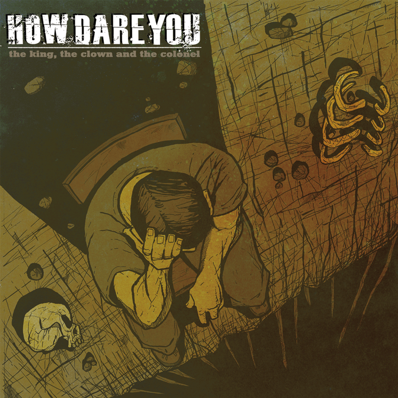
1) HOW DARE YOU – The King, the Clown and the Colonel LP/CD
Perspective has always been hard for me – as a visually impaired artist with a severe lack of peripheral vision, accurate perspective can be a serious challenge. But this image of a seated man staring down into a gigantic precipice, ribs and skulls scattered around him, was one that I feel that I got pretty close to right. Also, compared to my earlier stuff that went for bright, bold colors, this relatively muted palette was a new experiment, and eventually became somewhat standard.
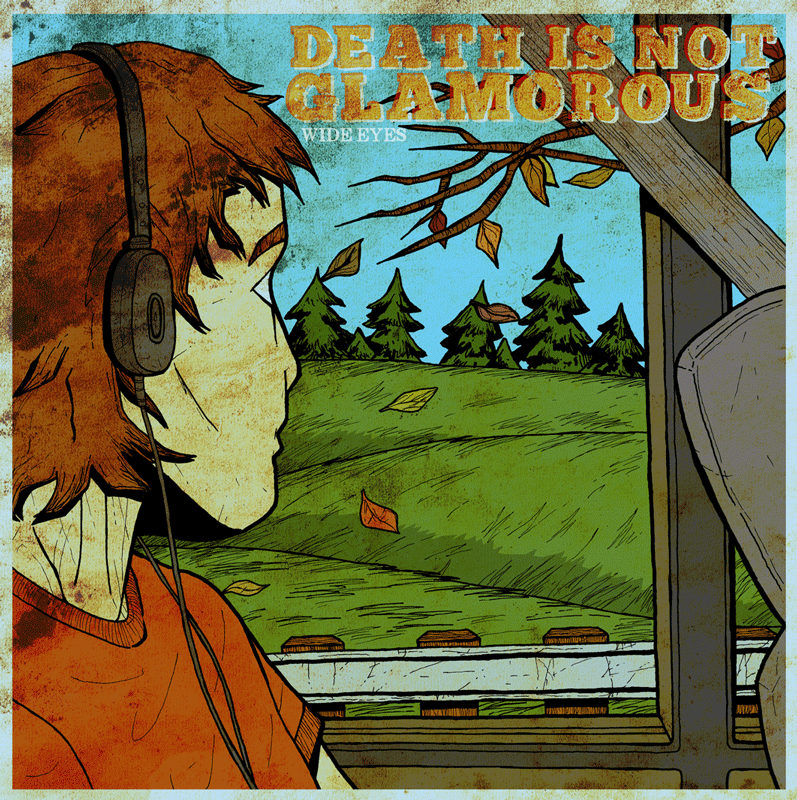
2) DEATH IS NOT GLAMOROUS – Wide Eyes LP/CD
This was a singles collection for Death Is Not Glamorous, gathering various splits and demos. It was originally released on CD many years ago, and my palette at the time consisted of bright, super-saturated colors with very little in the way of tonal shifts or dirtying anything up. Just bright-ass colors over relatively simple illustrations. When the band re-released the collection and asked me to repackage it years later, I was stoked – I’d learned a lot, and was eager to tackle a cover I was by then a little unhappy with. Hence this new layout and palette. I kept the illustrations and colors essentially the same, but added layers of grit to it, to give it a bit more nuance. And now, years after this second version has come out, I still see plenty of other things I’d like to change. I’m still learning.
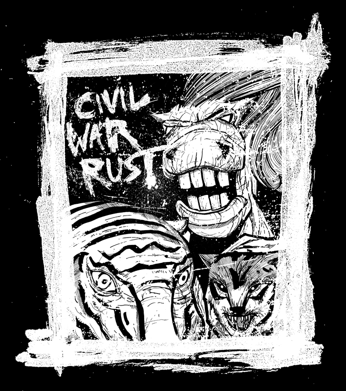
3) CIVIL WAR RUST – shirt design
Every once in a while you luck into a certain dynamic with an illustration and it just kinda carries the whole thing. This is far from my most technically adept illustration, but there’s a certain velocity to the various elements of this design (drawing, frame, logo, ink spatter) that just makes it leap out. One my favorite shirt designs, and a reminder that white on black illustration can be singularly striking, which I should keep in mind every time I start thinking that a design won’t be worth a damn unless it’s got a bunch of colors in it.
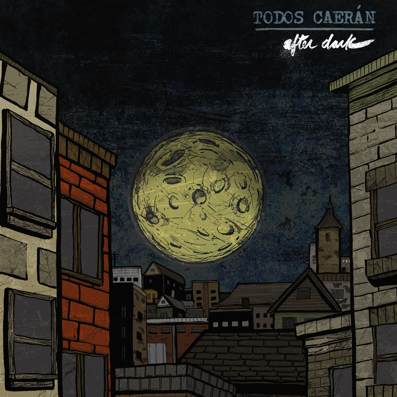
4) TODOS CAERAN – After Dark LP
One of my favorite LP designs; the cover has a die-cut hole in the center, and depending on which side of the insert is showing, either a full or quarter moon will be showing through the hole. It was the band’s idea and kind of a pain in the ass to lay out, but damn if it didn’t turn out cool. This album should also serve as a testament that drawing a marginally accurate cityscape for a legally blind dude with very limited peripheral vision is dang hard.
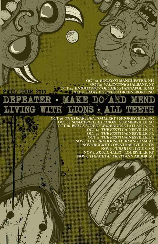
5) MAKE DO AND MEND / DEFEATER / LIVING WITH LIONS / ALL TEETH tour poster
Maybe the first show/tour poster I ever did where everything gelled just right. These four monsters adding equal counterweight to the text, and I remember that monochrome cast to the whole thing being an eye-opener for me. I also remember the type – all those show dates, all that information – being a nightmare to set. These still might be some of the coolest monsters I’ve ever drawn, and I’ve drawn a fair amount of em.
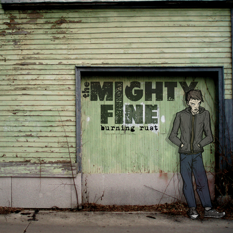
6) THE MIGHTY FINE – Burning Rust digital EP
This was an experiment that turned out nicely, mixing illustration and photography. I shot the background image of a weather-beaten garage near where I was living in Milwaukee, Wisconsin with an ancient digital camera, and then drew the figure afterwards. I spent a significant amount of time messing with the perspective and cast shadow; long before tablets or anything like that were readily available, this was just drawing, scanning, manipulating. Still stoked on how it turned out all these years later.
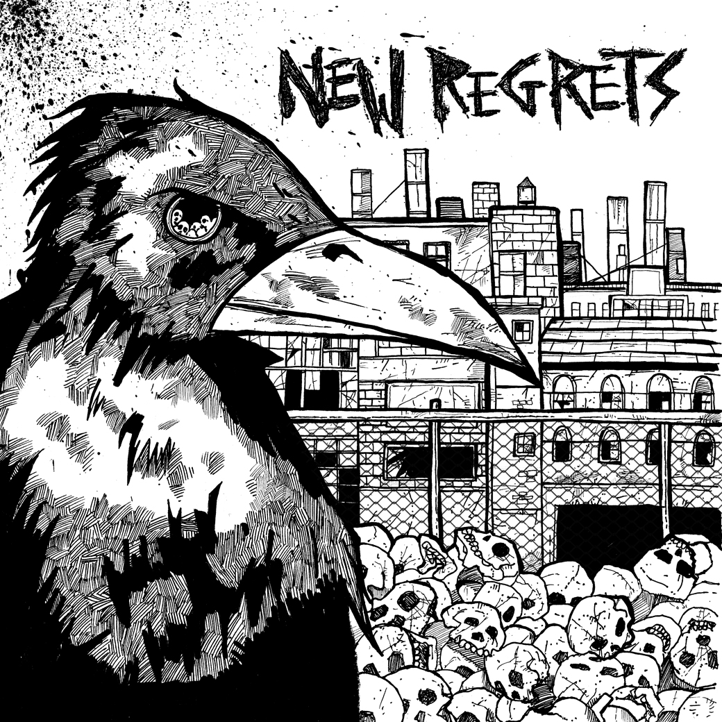
7) NEW REGRETS – S/T 7”
Fronted by Ed Pittman of Toxic Reasons, this was a band that just wanted a punk rock cover, and it was a blast to work on this. A bird, stacked skulls, factories with busted windows. The only part I cheated on is the fence – if you look, you can totally see that’s some chainlink I fully stole off ye olde internet and added in after I scanned the illustration. Gotta do what ya gotta do.
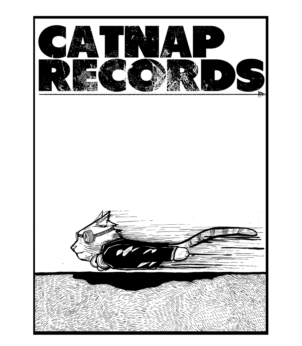
8) CATNAP RECORDSS – shirt design
Hey, sometimes your buddy wants a Naked Raygun spoof of Jettison for his label. But, you know, with cats.
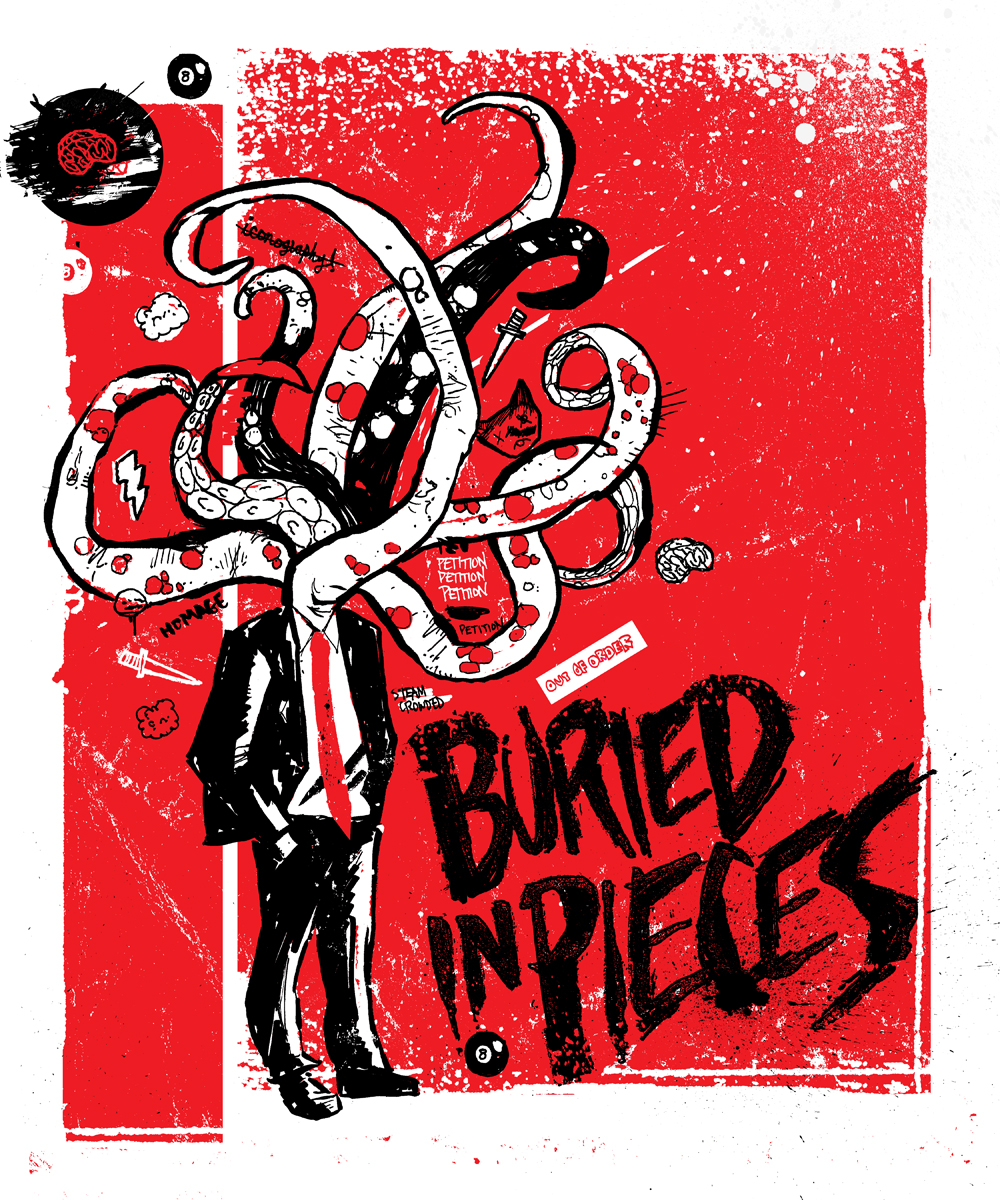
9) BURIED IN PIECES – shirt design
One of those loose, kinetic, bone-simple drawings that wind up working really well with two colors. You can definitely see me aping Steak Mtn. here, with the word repetition, the free and easy line quality, the heavy contrast, and, well, the subject matter. Gotta say, while I mentioned folks like Cometbus and Lant, Chris Norris (aka Steak Mtn.) is one of the most versatile and enduring visual artists to ever come out of punk, and probably one of my favorite artists overall. The stuff he did during his Combat Wounded Veteran days is seriously untouchable. I’m not always a fan of everything that he does these days, but I almost always spend a fair amount of time trying to figure out how he does it, and that’s not something I can say about a lot of folks. Anyway, this one turned out weird and lurching and cool, and Buried In Pieces grabbed it up.
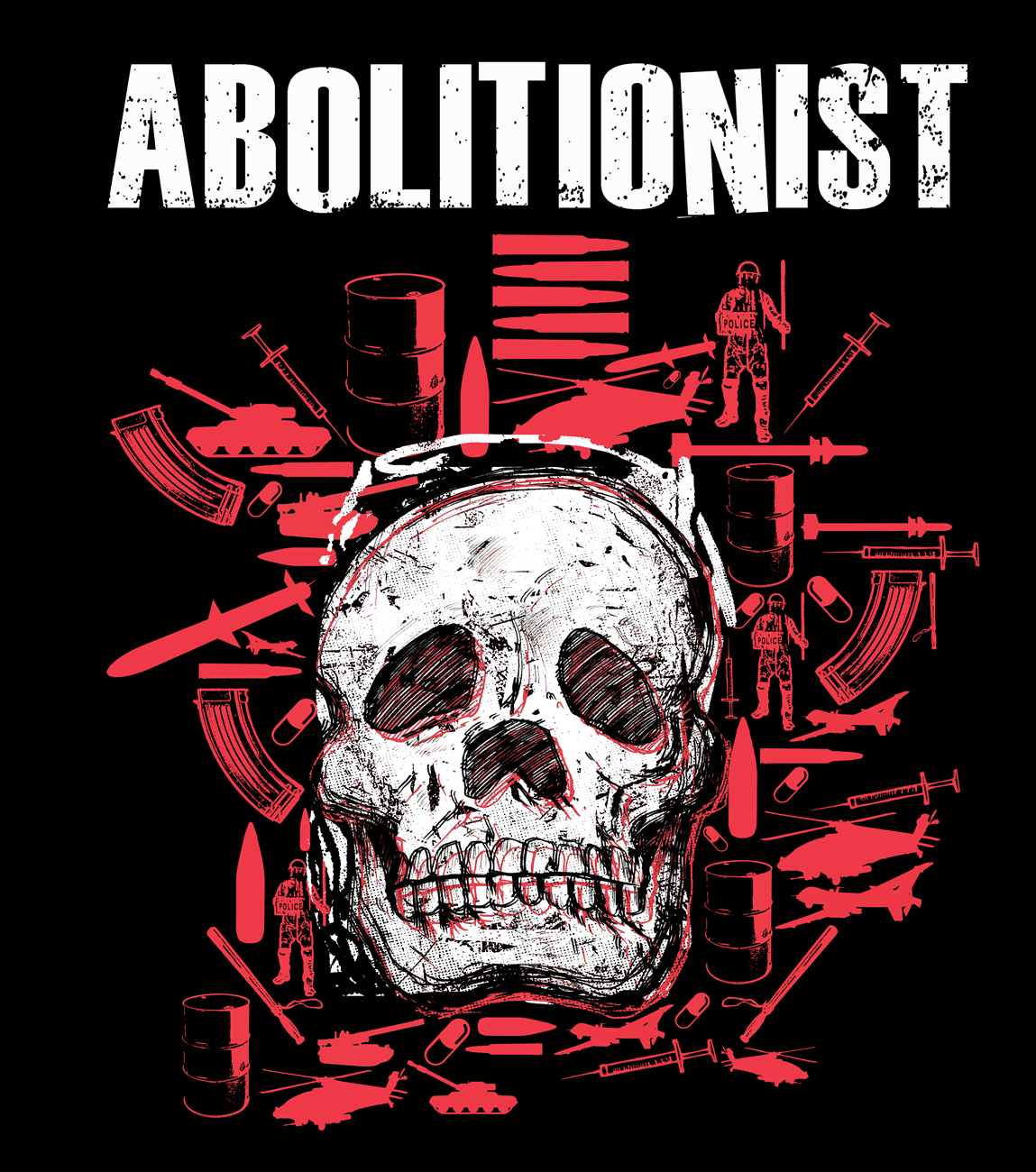
10) ABOLITIONIST – shirt design
Lant and Subhumans. Steak Mtn. and Against Me!. And, I guess, Abolitionist and I. While the band has certainly utilized other artists and designers on their projects, they’re one of the bands that I’ve done the most work for over the years. Two album covers, two 7”s, a collection, and probably dozens of shirt and poster designs. It’s been cool to work with a band over the long term and kind of get in the rhythm of how a certain visual aesthetic can match their sonic output. So yeah, here’s a skull surrounded by a bevy of silhouetted image of war and industry.
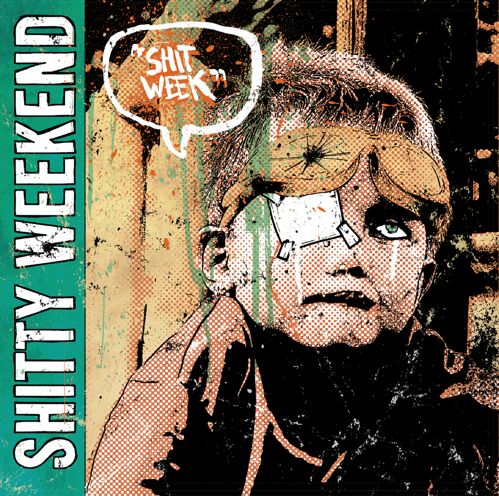
11) SHITTY WEEKEND – Shit Week LP
One of my first forays into heaaaavy image manipulation and layering. The root of this cover, the base image, is a stock photo of a little kid wearing a pair of goggles. Thanks to Photoshop’s most blessed of tools (the Stamp tool, thank you very much), a great amount of hand-rendered lettering and illustrative pieces, various scans of halftones, and plenty of ink slop, I’m hoping that a) this turned into a pretty rad album cover, and b) the kid’s own mom wouldn’t even recognize him if she happens to be flipping through the bins at her local record store in the Bands With Swear Words In Their Name section. Point being, sometimes all you need is a singular image, and the whole piece kind of unfolds around it.
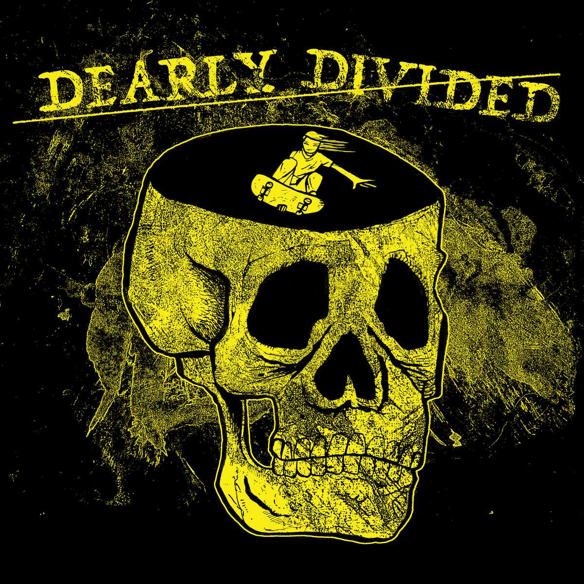
12) DEARLY DIVIDED – shirt design
I’ll tell you a secret. I have about four or five scans of messed-up ink splotches that I made years ago. I scribbled ink all over pieces of paper, then scanned them in at a large size and high resolution. Once you do that, particularly if the ink splotches are washes – not pure black, but varying degrees of gray – and you mess around a bit with that magical stamp tool, you get a beautiful, highly malleable, high contrast background like the one used in this shirt design, in which a dude is skating the curved bowl of a giant skull. Now that you know that, I bet you can find lots of samples in my work where I use this exact scan.
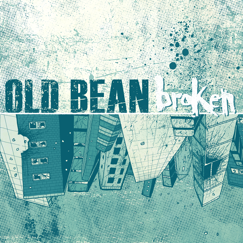
13) OLD BEAN – Broken EP
Wasn’t sure about including this one, but it’s got a nice dual monochrome thing going on color-wise, and I like the skewed perspective and the hand rendered lettering here.
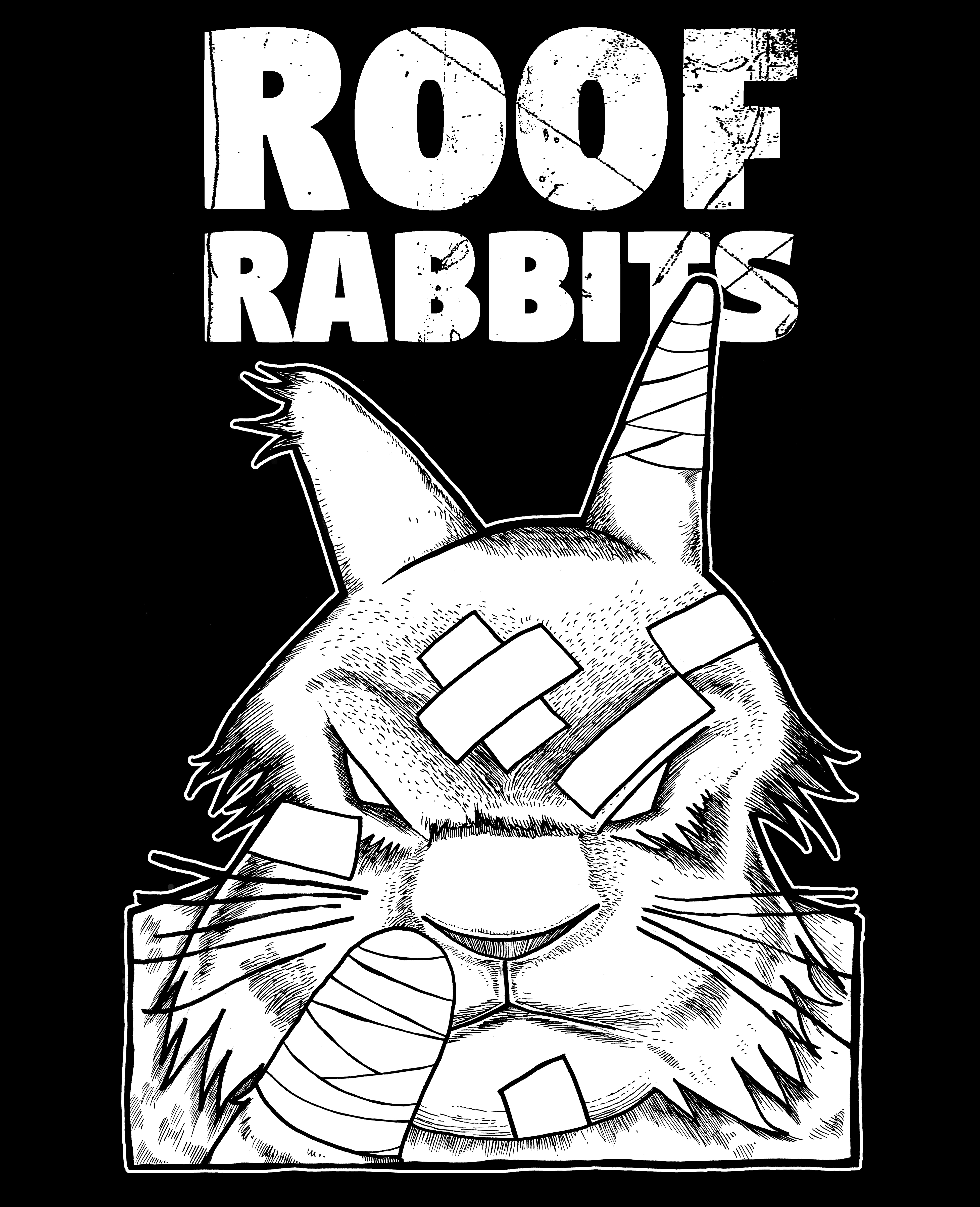
14) ROOF RABBITS – shirt design
Sometimes a simple, detailed illustration and bold lettering work well together. No need to for go in flash or Photoshop fuckery. It just works as a standalone image. This shirt design, of a vengeful rabbit with a missing foot, is one of those. Sometimes white on black is the simplest, most effective design tool there is.